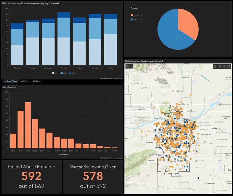
Data visualisation is a powerful way to represent complex data in a visual format, making it easier to understand, analyse, and communicate information. Whether you’re just starting out or looking to refine your skills, understanding the principles and steps involved in proper data visualisation is essential. This guide will walk you through the basics, from data cleanup and preparation to choosing the right visualisation techniques.
1. Understanding Data Visualisation
Data visualisation is the process of transforming raw data into visual representations, such as charts, graphs, and maps. These visuals help convey insights that might be difficult to grasp from raw numbers alone. By visualising data, patterns, trends, and outliers become more apparent, enabling better decision-making.
Why is Data Visualisation Important?
- Simplifies Complex Data: Visuals make it easier to interpret large datasets quickly.
- Enhances Data Interpretation: It allows you to spot trends and patterns that aren’t immediately obvious in raw data.
- Improves Communication: Visuals help convey information more effectively to others, whether in reports, presentations, or dashboards.
2. Principles of Effective Data Visualisation
Before diving into the technical aspects, it’s important to understand the key principles that make data visualisation effective:
- Clarity: The visualisation should clearly communicate the data without unnecessary distractions.
- Accuracy: Ensure that the visual representation of data is accurate and truthful, avoiding misleading interpretations.
- Simplicity: Keep the design simple and focused, avoiding clutter or overly complex visuals.
- Relevance: Choose the type of visualisation that best represents the data and the message you want to convey.
3. Preparing Your Data
Before you can create effective visualisations, you need to prepare your data. This involves several key steps:
Data Cleanup
Data cleanup is the process of identifying and correcting errors, inconsistencies, and inaccuracies in your dataset. Here’s how to go about it:
- Remove Duplicates: Ensure that your dataset does not contain duplicate entries, which can skew your results.
- Handle Missing Data: Decide how to deal with missing data. You can either remove these records or use techniques like imputation to fill in the gaps.
- Correct Errors: Look for and correct errors in the data, such as incorrect entries or typos.
Data Transformation
Once your data is clean, you may need to transform it to make it more suitable for analysis and visualisation:
- Normalisation: Scale your data to a consistent range, especially when dealing with multiple variables.
- Categorisation: Convert continuous data into categorical data if needed (e.g., grouping ages into ranges).
- Aggregation: Summarise your data to a higher level (e.g., daily sales data aggregated into monthly totals).
Data Enrichment
Data enrichment involves adding more information to your dataset to provide context or enhance analysis. This could include:
- Adding Calculated Fields: Create new fields based on existing data, such as calculating the average sales per month.
- Integrating External Data: Combine your data with external sources for deeper insights (e.g., adding demographic information to sales data).
4. Choosing the Right Visualisation
The type of visualisation you choose depends on the nature of your data and the message you want to convey. Here are some common types:
- Bar Charts: Ideal for comparing quantities across categories.
- Line Charts: Best for showing trends over time.
- Pie Charts: Useful for showing proportions within a whole.
- Scatter Plots: Great for showing relationships between two variables.
- Heat Maps: Useful for visualising data intensity across two dimensions.
5. Tools for Data Visualisation
There are many tools available to create data visualisations, ranging from beginner-friendly to advanced:
- Microsoft Excel: A good starting point for simple charts and graphs.
- Tableau: A powerful tool for more complex visualisations and dashboards.
- ArcGIS Online Dashboards: Ideal for geographic data visualisation.
- Power BI: A versatile tool for integrating and visualising data from multiple sources.
6. Best Practices for Creating Visualisations
- Start with a Question: Identify the question you want to answer with your visualisation.
- Know Your Audience: Tailor your visuals to the needs and knowledge level of your audience.
- Iterate and Refine: Create multiple versions of your visualisation and refine them based on feedback.
- Tell a Story: Use your visualisations to tell a clear and compelling story that guides the viewer through the data.
Data visualisation is a crucial skill in today’s data-driven world. By following these principles and steps, even beginners can create visualisations that are not only accurate and insightful but also clear and engaging. Whether you’re cleaning up data, choosing the right chart type, or refining your design, these foundational practices will help you make the most of your data and communicate it effectively.


